Campaign Break Down
The campaign I created for your company is a combination of advertisements in different forms (Direct mail, magazine, billboard, storyboard for a commercial, and social media). Although advertisements vary in physical appearance, they all have common elements that connect them together to become one cohesive advertisement.
Who is this geared towards?
In order to create this campaign I had to decide on what target market I was going to try and reach. Since a majority of your patients are children, I tried making the ads appealing to them with fun colors and photos. But the main message of the advertisement is geared towards the parents of children affected by autism. Your company provides lots of services, and showcasing those can help attract parents that ARE and AREN'T specifically looking for ABA therapy. (Including these widens your target market.) TARGET MARKET: Families impacted by autism, live in the Naperville area/surrounding suburbs, looking for a happy/effective way to learn.
What are the common elements?
- Color scheme (pale yellow, red, green, white)
- Colorful hands (photo and/or border)
- listing services
- mentioning the "quality of quantity" services
- inclusion of logo
- Tekton Pro and Century gothic font styles
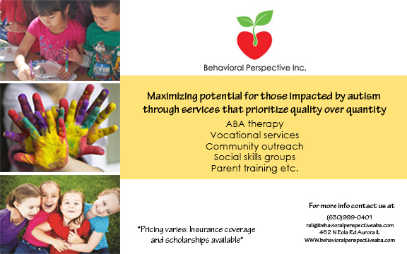
Half Page Magazine Ad
Since a half page magazine ad is not very large, I wanted to create something eye catching so that the ad would not be overlooked. The headline of the ad is the most important written aspect because it is the main message your company is trying to get across. The follow up (copy) below it is non-traditional because I really wanted to let customers know right off the bat what unique services you provide. The 3 happy pictures used as a border on the left are meant to attract both the kids and the parents, and helps bring a sense of relief that their is a company that is providing what theyre looking for.
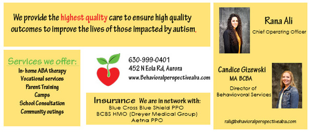
Direct Mail Ad
Front of Ad
Back of Ad
The most important image of this ad is the hands; I want to get the idea of a fun, happy, hands on experience into the customers heads. In the headline I used the "YOU" method because I wanted one ad specifically geared towards the customers that will be using the services. I am still trying to reach the parents, but using the "you" method lets your customers know that you care, and it forms a closer bond between the customers and the company before they even call/email for more information. I also thought that including both Rana and Candice's photos was an import aspect of this direct mail ad. It is often very comforting to know who the head of a business is and what he/she can do for you. I used a checkerboard type of layout on this so that I could include lots of information without overwhelming or confusing the customers. The Business ID and logo are not surrounded by a yellow box because this allows them to be the center focus of the back of the ad, and it is more likely that customers will use this information.
Billboard Ad
Billboards are large and in charge, but drivers don't get to take a very long look at them while driving on the highway, so I wanted to create a strong yet simple ad that could be easily read in a short amount of time. I wanted the logo to become memorable so I made it very large. I only included a phone number because that is a quick thing to write down, and Behavioral perspective could easily be called on the spot. I did not use an actual photo of the hands because I thought it would become distraction, so I opted to use the hands border because it still correlates with the other hand photo and makes the campaign cohesive.
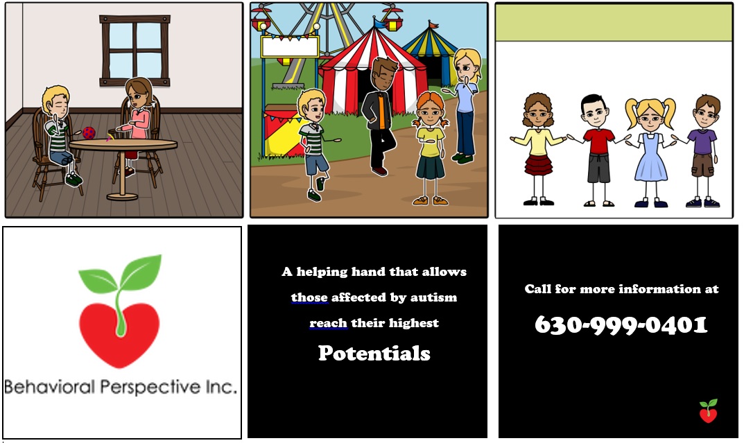
Story Board
This story board is for a tv commercial that is meant to be played during day time/early evening on women and family channels on TVs in the areas surrounding Naperville and Aurora.The ad will not include much talking until the last two slides shown above. I wanted to show short clips of the different services you offer and then flash to children holding hands (hands are painted like photo). Your logo will then appear on the screen so that the viewers can connect your logo with the commercial. Happy yet subtle music will play in the background to portray a happy and lighthearted company.
Social Media
Possible profile photos
I know that you guys are big into using Facebook as your main social media type, so I just wanted to suggest some ways to enhance what you already use. I took some pictures off of your website and edited them to include a logo, or something related to your company. If you use these as your profile photo r even just post them on your page, people can connect the ads from the campaign to your site. Posting these images and writting a little bit about your company and then getting customers or friends to share it can spread the word to people all over facebook, without any cost. It is another form of advertisement, that can help you reach several customers of your target market. The awareness of the business could also help in the long run regarding sponsors etc.


